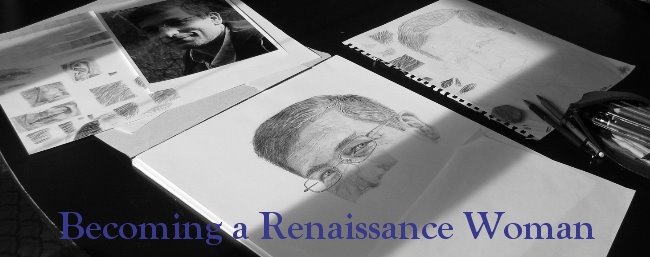
On Drawspace I manage the weekly drawing challenges. When I am looking for new hosts to put up their photos, I give them some tips on how to pick a good picture that people will want to draw.
Here are some guide lines for picking successful pictures. 1. There should be no blurry areas, except artistic, the pictures need to be sharp. 2. When you put the picture in grayscale, you should see a full range of tonal values, (black thru white) not a general shade of grey. 3. There should be no flash used (unless you are a professional photographer and know how to light a picture), natural light is preferable.
Okay now you have a great photo and you have drawn or painted the picture. Why does your drawing sometimes make you go "Wow, I did that" and sometimes feels like it has missed the mark? The thing we were discussing is depth. I was showing Wilson, on PhotoFiltre, how you can grayscale a photo and then posterize it to exaggerate the shadows, or tones, in the pictures. This can really help teach you to see the values in the photo that you want to get in your drawing. What I didn't get a chance to discuss (with Uncle Wilson) was that you can do the same thing to your drawings. This is what I did this morning. I took a look at my recent Bird of Prey pictures as well as my owl from Halloween. I was very happy with how my owl turned out and I had varying degrees of happiness with the rest. I then applied greyscale and posterizing to the original photo and my drawing. Here are the results.
 Bird of Prey 1
 Bird of Prey 2
 Bird of Prey 3
 Owl
Owl
The photos that I worked from are beautiful works of art in themselves and this shows through. If you look at the greyscale you can see a wide tonal range in each picture. Now in comparison that is not always the case in my drawings. I do believe this is one of the reasons why I have those varying degrees of happiness with my different drawings. Now with the posterizing (exaggerated shadows and tones) I can see where I needed to go darker with my colours and where I needed to go lighter. One thing to note when working with colour pencil, and I would think any other colour medium, a heavier hand does not make a darker colour. Certainly you have to fill in the paper more solidly but you also have to use darker shades of the colour and more layering of complimentary colours. For example, the yellow of the owls eyes, I used various shades of yellow as well as purple in the darker shaded areas.
Anyways...look and compare and train your eye to see the different values in the picture you are drawing.
Please click on the titles of the photos to go to my original posts, I give credit to the photographers and you can see more of their work.
 Bird of Prey 1
 Bird of Prey 2
 Bird of Prey 3
 Owl
OwlThe photos that I worked from are beautiful works of art in themselves and this shows through. If you look at the greyscale you can see a wide tonal range in each picture. Now in comparison that is not always the case in my drawings. I do believe this is one of the reasons why I have those varying degrees of happiness with my different drawings. Now with the posterizing (exaggerated shadows and tones) I can see where I needed to go darker with my colours and where I needed to go lighter. One thing to note when working with colour pencil, and I would think any other colour medium, a heavier hand does not make a darker colour. Certainly you have to fill in the paper more solidly but you also have to use darker shades of the colour and more layering of complimentary colours. For example, the yellow of the owls eyes, I used various shades of yellow as well as purple in the darker shaded areas.
Anyways...look and compare and train your eye to see the different values in the picture you are drawing.
Please click on the titles of the photos to go to my original posts, I give credit to the photographers and you can see more of their work.


No comments:
Post a Comment